The project showcases a comprehensive design process for a bicycle-sharing mobile application, focusing on a clean aesthetic and a seamless user experience.
1. Project Overview and User Process
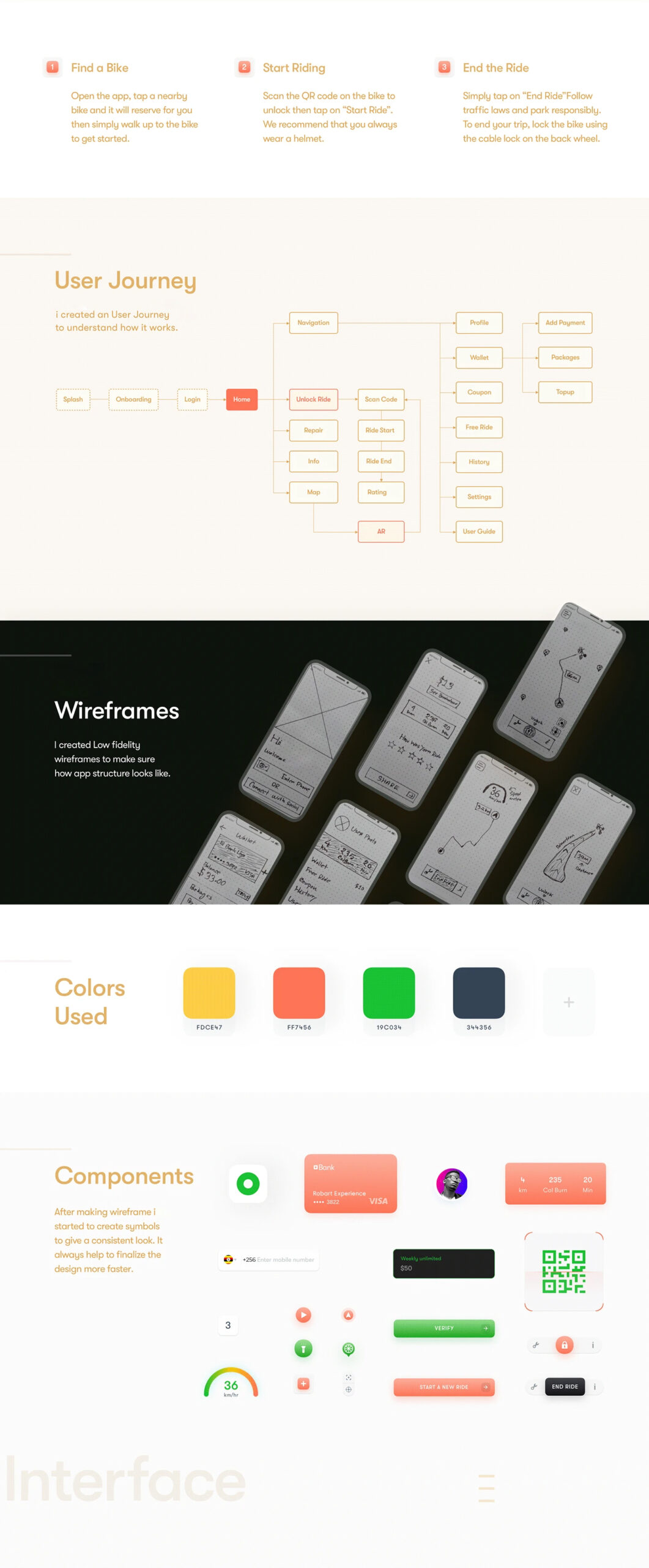
The design begins by outlining a simple three-step core user journey to ensure the app is accessible to new users:
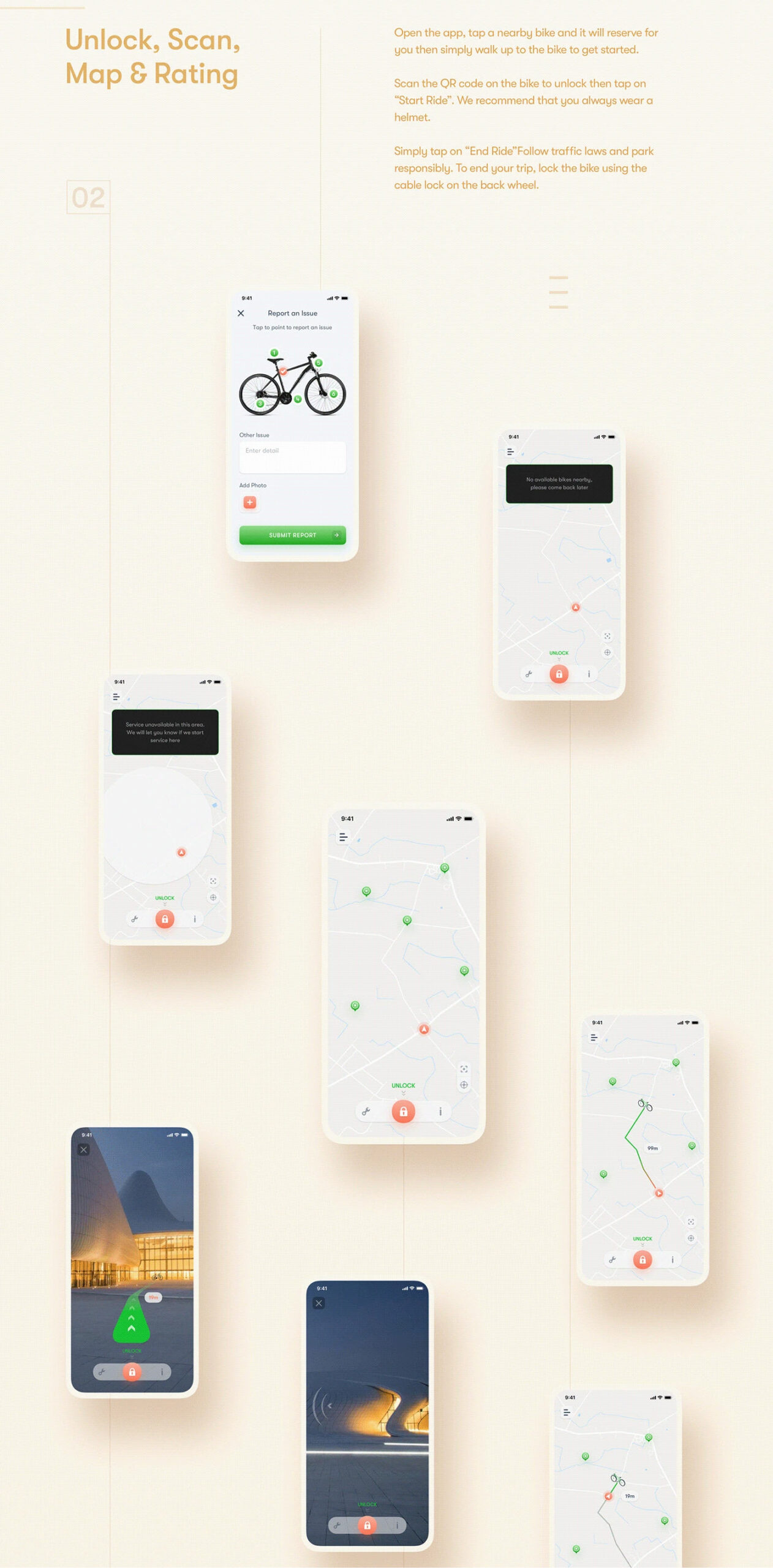
Find a Bike: Users open the app to locate and reserve a nearby bike.
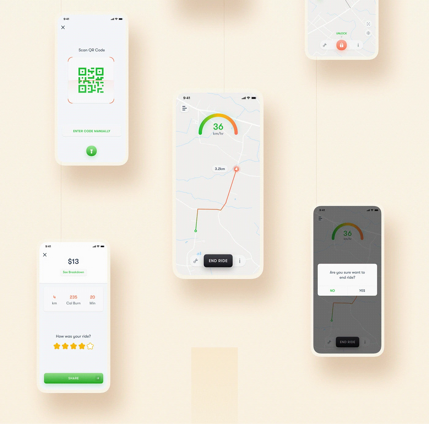
Start Riding: Users scan a QR code on the bike to unlock it and begin their trip.
End the Ride: Users park responsibly, end the ride in the app, and manually lock the bike.
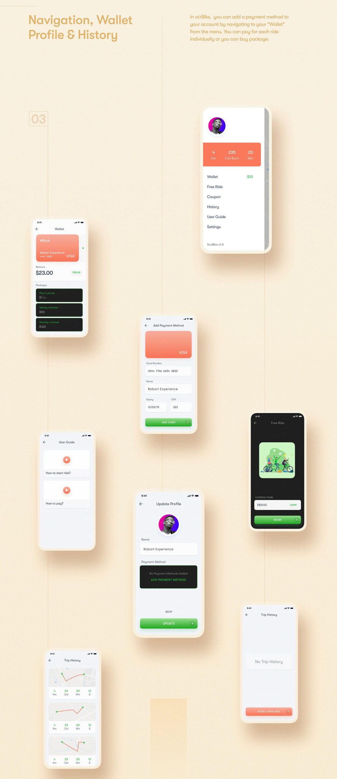
2. Design Architecture and Planning
To ensure a logical structure, the designer documented the foundational elements of the app:
User Journey Map: A detailed flowchart mapping every possible interaction, from the initial splash screen and onboarding to navigation, payments, coupons, and ride history.
Wireframes: Low-fidelity sketches were created to establish the app’s structural layout and content hierarchy before adding visual styles.
3. Visual Identity and Design System
The project utilizes a vibrant and modern visual language:
Color Palette: The design uses a mix of energetic colors including Yellow (#FFCF52), Coral (#FF745A), Green(#00D231), and a deep Charcoal (#343D46) for contrast.
Components: A consistent set of UI symbols and components—such as buttons, toggles, QR code scanners, and credit card interfaces—was developed to ensure a cohesive look throughout the app.
4. Interface Modules
The project is divided into three primary interface categories:
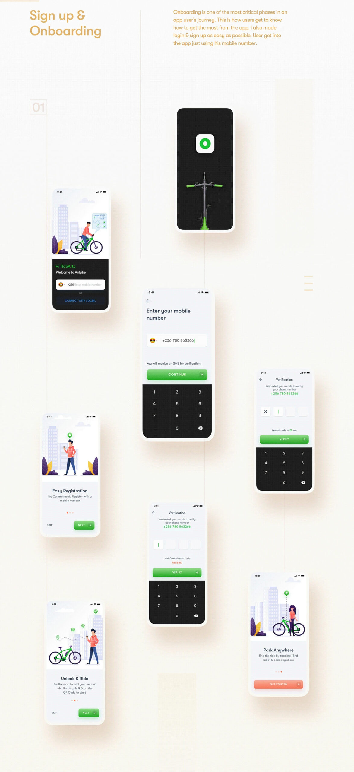
App Onboarding: A series of screens designed to introduce users to the app’s value proposition and guide them through registration and login.
Home & Scan Experience: The core of the app, featuring interactive maps for locating bikes, a QR scanner for unlocking, and real-time ride tracking dashboards showing speed and distance.
Payment & Profile: Dedicated screens for managing digital wallets, viewing ride history, applying promo codes, and personalizing user settings.
The overall design emphasizes minimalism and clarity, using ample whitespace and bold iconography to make urban navigation feel effortless for the user.